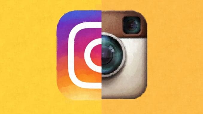
In the early 2000s, 3D logos were all the rage. Take for instance the first logo introduced by Google in 1997 (all you can say is “yikes” after seeing them). After a few redesigns at the turn of the century the company settled with a much cleaner 3D design. But fast forward ten years and everybody was changing to 2D designs. 3D logos had become a thing of the past even before we knew it. Do you wonder why we had this sudden change to flat designs?
When you are searching the internet today you scroll past a lot of the same logos over and over again. What do the logos of Google, Instagram, Netflix, YouTube, Coca Cola have in common? They are all 2D. In the mid of the 20th century, the logos for the most part were all flat designs. They were simple, clean and 2D. Rather than just trying to get the names out there, companies realized how impactful symbols were. They started to put a lot more thought in the design process. With the 1970s came CGI and from there logos started to come to life. But the real change came at the turn of the century, Adobe developed InDesign and Photoshop and digital graphic design tools were at everybody’s fingertips. Logos were going 3D.
In the early days of the world wide web, people started to use the internet for every little thing. Designers wanted to help people easily navigate internet enabled devices. They used what’s called Skeuomorphism. Which when we are talking about user interface design, means making digital features resemble real life objects. The save icon is skeuomorphic, but after we stopped using the floppy disk in real life it became less so. People wanted technology, specifically touch screen technology to be intuitive and easy to use and dragging a file to the trash can on your screen felt instinctive.
Skeuomorphism was brought to life by using gradients, drop shadows and fake textures to mimic depth. The iPhone and iTouch were the first big time capacitive touch screens. They had no buttons and no feedback unlike the resistive touchscreens you use at grocery stores or ATMs. The 3D designs combined with vibrations and clicking sounds made users feel like they were pressing real buttons. 3D logo designs were vital to make people feel comfortable in the new developing age. As the world got more comfortable using these technologies, skeuomorphism and 3D designs became less important and designers started to shift back to 2D.
Critics of skeuomorphism argue that it was cluttered and harder to use because of the excessive gradients, beveled edges and reflections. Flat designs conserved space in a limited user interface and provided a cleaner feel. Skeuomorphism can also constrain design. When you go fly you are no longer tied to the physical world and ideas and interfaces can take on a more abstract form. Take the hamburger menu you see a lot in flat design, it is the opposite of skeuomorphism because there are no hamburger menus in real life. But the menu design was sleeker and incredibly easy to use while saving space on the screen.
People were tethering between flat and skeuomorphic designs for a little bit before the world changed overnight, literally. On September 18th, 2013 Apple’s iOS updated to iOS 7 and we woke up to flat world. At first people were not happy with the new operating system. They didn’t know what was clickable and what wasn’t and more than anything, who likes change? The glossy textures from the operating systems before were gone. All the apps had 2D designed icons. That meant logos needed to switch to 2D to keep up with the times and logos from everywhere started to change from 3D to flat designs over the next few years.
Not only was 2D perceived to be easier for users but it was also a lot easier on the designers too. They can create logos that are high quality but required less time to make and a simple vector design can be expanded and shrunk for any device or medium easier than 3D logos ever could be. Today almost everything we see around the internet has a flat design. Like all branches of design logos are stick-like. 2D was in, then it was out and now its in again. But don’t count skeuomorphism out just yet. With the rise of augmented and virtual reality, skeuomorphism has to stay alive so that we can touch and feel digital objects in a very real way. What will these logos look like in the future? Its hard to tell but for now we just hope that we don’t wake up to a whole new interface on our phones.
Curated by- Nayan Mane
Source of information- Cheddar TV Network


Be the first to comment