Seldom are typefaces divisive, nor are they burdened with public opinion. However, there is one typeface in this sea of indifference that even had a group created to ban it. Enter Comic Sans.
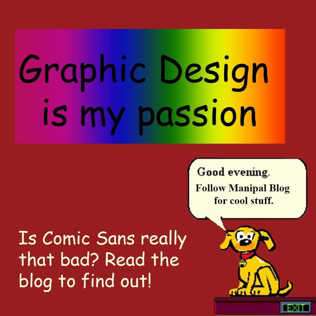
Created in 1994 by Vincent Connare for a software called Microsoft Bob, a tool to help kids learn computers. The software opened up with a cartoon dog whose speech bubble was in Times New Roman. Connare had an epiphany – “That’s not how a dog talks!” Drawing inspiration from The Watchmen and Batman comics, he set out to create a font that was different from the rest. In a time where the only font options were Times New Roman and something Helvetica-esque, Comic Sans provided users a tool of expression. While Comic Sans didn’t make it out in time with Bob, it was released in a web pack the next year.

The disdain about Comic Sans amongst designers stems from a variety of factors, but the most prominent one is that — It. Just. Doesn’t. Work.
Comic Sans doesn’t have a consistent visual weight, nor do its letters fit evenly. While its lack of professionalism irks designers alike, it was the explosion amongst non-designers that saw the typeface being used anywhere and everywhere. One could connect the strong public aversion to its ubiquity and, therefore, its inclusion in and association with bad design. Bad design is not limited to visually unappealing posters or flyers; it also applies to inappropriate usage of the font. Case-in-point is the Higgs-Boson presentation created by scientists at CERN.

The general upset for this typeset even led to the creation of a group called ‘Ban Comic Sans’ that had its own manifesto. The group was founded by Holly and David Combs, a husband and wife designer duo because the unwarranted use of Comic Sans hurt their design sensibilities. The manifesto calls its use “heretical” and likens it to “[S]howing up for a black tie event in a clown costume.” Some criticisms for the font are that it comes off as irreverent and silly.
Connare’s creation, in his own words, was not meant for everyone. “My original idea was it was
bgoing to be used for kids. It wasn’t made for everybody to like it,” he told LiveScience in an interview.
Not a typeface intended for print, Comic Sans’ primary utility was to improve readability on the Windows 95 pack it was installed on. In a time where traditional fonts looked ‘lego-like’ due to the absence of anti-aliasing technology. Anti-aliasing technology allows for jagged lines to look smooth on screens. The casual and non-technology look was also part of Comic Sans’ appeal. According to Connare, Comic Sans stood out to people amidst the 200-300 pre-installed typefaces and was the least textbook-like. It felt handwritten and, therefore, more comforting in some sense when compared to the rigidity of the serif-laden fonts like Times New Roman or Garamond.
The mirroring of our natural writing tendencies dictated by rounded letters and ample spacing is why Comic Sans is considered a dyslexia-friendly font. Dyslexia, a reading disability with a neurological origin, is characterized by difficulties in recognizing words, poor spelling, and decoding abilities. Dyslexia comes in many forms; however, a common issue is the difficulty in recognizing letters that are similar, like b/d, p/q, and n/u.
The irregularity that makes Comic Sans hated in the design community is a feature that helps people with dyslexia. However, empirical evidence on whether special fonts improve readability is not very clear. A 2013 study by researchers in Barcelona found that certain well-known fonts like Arial and Verdana help readability. They suggest that “sans serif, monospaced, and roman font types increased significantly the reading performance, while italic fonts decreased reading performance.” Anecdotal evidence, on the other hand, recommends Comic Sans because it helps in limiting confusion. Other recommendations include font size, colors, and more spacing between letters.
While hating Comic Sans might be a trope amongst designers, it is considered ableist to hate the typeface by people in the community. The aesthetics of a piece should not trump the function is a common argument. Therefore, we should be aware of the font’s utility and realize that ultimately designing for accessibility should be at the forefront. And if the aesthetics still bother you, the British Dyslexia Association recommends Verdana, Tahoma, Century Gothic, Trebuchet, Calibri, and Open Sans.

About the Author – Reyana is a first-year MA student at MIC with a Bachelor’s in Information Systems, Reyana took to screens a decade ago and hasn’t looked back. Primarily interested in humanist tech and design, she also likes to write about the slow, analog approach to a life centered around memories.

Be the first to comment