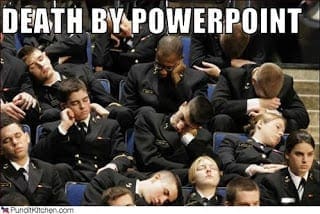
The way the teachers act, I think they think PowerPoint presentation filled with random stuff and flow charts and tables are somehow going to magically capture our attention and teach us everything. The so called magic-teaching device they think it is…it isn’t.
I’ve just sat through a whole week of classes almost all of which involve a ppt. presentation gone wrong. The slides have giant tables and charts, or the background colors are wrong, or the print is too small or too much matter is crammed on the slide. Or they are plain boring (but that usually isn’t the PowerPoint’s fault….it’s the subject’s fault).
I wish the teachers understand that ppt’s aren’t the main teachings device, it’s just another teaching aid , one I’d like to see a lot less of. All the bad ppt’s are putting me to sleep, boring me or making me realise it’s not worth the effort to pay attention. Which isn’t a good thing since my new year’s resolution happened to be to pay attention in class.
Here are 5 things what I wish the professors or whoever makes slides know
- Don’t experiment with crazy colors for the background or the text. A lot of times the colors clash and I can barely see anything. Bright colors don’t make me want to pay more attention. I’ll pay the same amount of attention for black script on a white background. And just so you know, if you have to turn off the lights for me to see the slide, I’ll be planning on sleeping.
- If you just make a lot slides with points, and by your way of teaching you just read them out, I will stop paying attention. I can read the slides too you know. Or I could just read the textbook later.
- If there is too much info on the slides, I will give up trying to figure out which is important and which isn’t and might stop paying attention completely.
- If there are really really complex diagrams or flow charts, and I’m expected to copy it down, it’s probably not going to happen.
- If you are going to put fun animations on the slide to catch my attention, I’ll be paying so much attention to the animations that I might forget to listen.


Guess someone we need to tell this to is reading this. I donno whether its the hate for the technology,students or job or they just dont care much about the presentations but they need to seriously put them apart and do something about it.
The powerpoint system came into being while I was doing my 2nd year in Manipal. At that time, most of the prof's were being briefed on how to create a powerpoint and the basic rules of presenting material to the audience. The transition has no doubt not been comfortable from the OHP's [over head projectors]. The significance of how much a powerpoint helps assist a speaker depends on how he|she utilizes it. And considering they don't have adequate exposure on how to go about it, there is no surprises. To cite a few examples:1. Some use PPTs for a reminder of what to speak on. 2. Some use it for delivering lots of content in a short span of time. But at the end of the day, all lies in the hands of the speaker and you guys should make an effort to let them know your plight.
quite sometime back we had a Proffesor who used to scan books and present them for our history of architecture subject!once we noticed that she had stained her book with some curry while reading it..and the next day " the curry stained slides " (as it became famous afterwards)were projected on full screen for the class to enjoy!